Internet research to build better websites
It would seem increasingly easy for websites to engage users. However, too often the user experience is fundamentally flawed. This is typically from replicating the category wrongs, but more so from ignoring actual users when modelling the user experience (UX). Particularly large corporate and government websites can find it difficult to find simplicity in their complexity.
While inexpensive tools (such as WordPress and Squarespace) and budget freelancers are ever emerging to provide quick and cheap solutions, the reality is to create a simple yet sophisticated website with a positive user experience and robust back-end and functionality requires a higher level of strategic thinking, design and technical capability and investment.
There is an overarching trend towards less rather than more, and allowing a quick visit solution rather than a website one lingers on and explores. In the main websites are improving exponentially. Yet, users can still be faced with websites that are off-putting, confusing, cluttered, hard to navigate beyond the home page and not giving them a reason to explore nor ever come back.
This can be particularly the case when the category is quite complex. It is likely simple to create a clear and easy to build website if you sell a simple product or service. Yet, as the complexity increases (or the ability to keep it simple declines) the user experience likely starts to fall if not managed carefully. Think of complex websites such as banking, governments, universities and insurance companies. Given the large amount of information they are seeking to make available the user experience can be impacted dramatically. Similarly, some website that seem within the organisations to be clear and simple, are to users more so a train wreck.
It can be difficult to find the simple priority functionality for an uncluttered website, when users of diverse target audiences may visit for diverse reasons, and the enterprise has so much they need and want to say to so many different people.
There are typically four critical steps in developing a website …
- Definition (of strategic priorities)
- Design (of the front end, wireframe and architecture)
- Development (of the backend, coding, database and other functionality)
- Deployment (piloting testing, launching, observing and refinement)
Also vital is involving real users and potential users throughout the process.
Here are three ways you can involve users in website development.
User Data Analysis
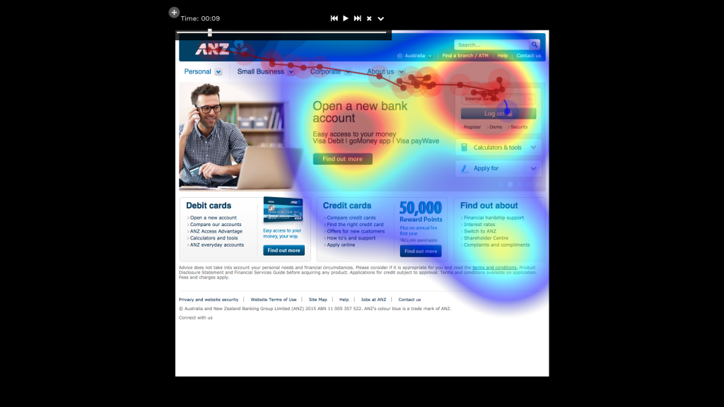
Analysis such as heat maps and mouse tracking (e.g Crazy Egg, Clicktale, EyesDecide, Mouseflow); and analysis of Google Analytics and other metrics are valuable to gain an understanding of how users navigate the website, including which areas are visited more, less and potential users issues worth considering in a redevelopment. More complex tools are available to embed into the website to provide insights to observe and analyse user navigation.
Qualitative Exploration
Qualitative research includes approaches such as focus groups and in-depth interviews, as well as on-line and off-line approaches. Face-to-face qualitative can be valuable to discuss the website related topics in a conversational way to deeply explore the best direction. On-line can overcome travel and geographic isolation issues and allow for research to be conducted over an extended period (e.g. diary like, or over a day, few days, week or more) and if the topic is sensitive where people may close-up if in the same room (e.g. personal finance or health issues). The key is finding the approach to deeply explore not just what users and potential users think they need and want, but why and how, and allowing a robust narrative.
Examples of approaches include a web clinic, similar to a focus group, of around 6–8 people (usually key segments are in different groups — e.g. target audiences) over around 90 minutes to discuss as a group current behaviour and key expectations of such a website; individual guided exploration of the current website to assess usability, appeal, ease of finding information / functionality / shopping items, and competitor comparison; and a group discussion of feedback, priorities and reactions to ideas being proposed for new website.
Behaviour and needs
- Current behaviour (in the category, not just on the website / online)
- Tools they use (to research / plan, purchase and share)
- Expectations in a website (for this category, what are the priorities — simple and complex needs in information and functionality)
Performance
- Overall reaction to current website (appeal, usability and layout)
- Assessment of performance (ease of finding priorities as above)
- Comparison with similar / competitor sites (what works and what doesn’t are the competitors all just the same, and getting it right or wrong?)
Priorities
- Overall feedback discussed (likes, dislikes, what was hard to find / access)
- Strengths and weaknesses (what needs to be retained, and what can go)
- Priorities in planning for the future design (how to make a great website)
Typically the assessment and discussion is based on mobile and desktop platforms and to identify strengths, gaps and opportunities. Such research could be conducted via online and/or offline, or even modified to be conducted via a larger workshop to explore and provide guidance.
Quantitative Measurement
Robust target market surveys are still the best way to profile users and potential users. Surveys can include navigation analysis such as tree testing (technique for evaluating the ‘findability’ of topics in a website — software example here), as well as further analysis of user and potential users.
This may include surveys of current users (e.g. via a website pop-up with a suitably enticing prize draw) and/or the broader market to measure via a representative sample to profile and measure the current behaviour, needs and website priorities moving forward. Surveys can also allow for segmentation (more here) and identification of 3–8+ unique groups of users to design the website around — key functionality, topics, content, promotion et cetera.
Surveys data can also be linked to other user data (if available) such as website data, sales, customer information and more to build the profile and assist with deeper segmentation and targeting of users and potential users.
Survey and Google Analytics and other website metric monitoring is valuable in tracking the impact of SEO and promotional campaigns, social media activity, website activity and conversions, and opportunities to refine the site.
…
Research can be valuable in gaining candid feedback from users and potential users as to the reality beyond internal and technical perspectives. From our own research there is often a mismatch between internal priorities and users, such as where priorities exist and key needs. Further, research can provide critical evidence of any need to revolutionise to convince internal stakeholders and funders that the current website is in need of an urgent rethink. Research is valuable in understanding how users navigate the website, key user and potential segments to target and an in-depth exploration to support design and positioning to build an engaging site.
User research is as important to a solid complex website as design and technical ability. It provides clarity as to what is working and not, and helps guide priorities and how to achieve simplicity and a positive user experience.


